
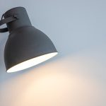
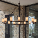
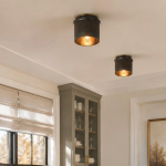
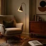
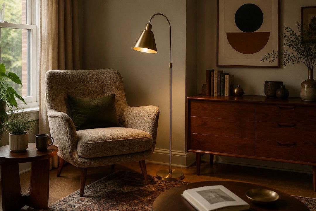
You’re looking to create a cozy reading nook with that warm, inviting 70s brass lighting vibe? Smart move. It’s all about channeling that era’s penchant for comfort and a touch of statement style. Think less disco ball, more mellow glow. Brass retro lighting is perfect for this because it casts a warm, diffused light that’s ideal for losing yourself in a book, and that distinctive golden hue just screams cozy. We’ll dive into how to pick the right pieces, position them, and tie it all together without making your space feel like a museum exhibit.
That warm, inviting glow. That’s the magic of 70s brass lighting. It’s not just about illumination; it’s about atmosphere. The materials and designs of that era, especially the use of brass, contribute to a feeling of warmth and comfort that’s incredibly conducive to reading.
Why Brass?
Brass, with its natural golden undertones, has a way of reflecting light Keilson that feels softer and more inviting than chrome or stark white. It’s a material that ages beautifully, developing a patina that adds character rather than looking worn. This warmth is precisely what you want when you’re settling in with a good book.
The 70s Aesthetic: Comfort and Character
The 1970s were a time when interior design embraced comfort, texture, and a certain unapologetic style. Think plush fabrics, earthy tones, and lighting that was often as much a decorative element as a functional one. Brass lighting from this period frequently featured organic shapes, intricate detailing, or a bold, geometric simplicity. It’s this blend of functional warmth and stylistic presence that makes it so effective for a reading corner.
Beyond the Bright Bulb: The Role of Light Quality
It’s not just the fixture itself, but the quality of light it produces that matters for reading. 70s brass lighting often uses shades made of frosted glass, textured fabric, or even woven materials. These diffuse the light, preventing harsh glare and creating a softer pool of illumination that’s easier on the eyes for extended reading sessions.
Selecting Your Brass Retro Lighting Fixtures
Choosing the right lamp is crucial. You’re not just grabbing any old lamp; you’re looking for a piece that embodies the 70s spirit and provides the right kind of light for your reading sanctuary.
Desk Lamps: The Workhorses of the Nook
A classic desk lamp is a go-to for a reading corner. Look for designs with adjustable arms and heads so you can direct the light precisely where you need it.
Iconic 70s Desk Lamp Styles
- The Articulated Arm: These lamps, often with a spring-loaded or tension-based adjustable arm, are incredibly functional and have a distinct industrial-chic feel that was popular in the 70s.
- The Mushroom Lamp: While often seen as a bedside lamp, a smaller mushroom-style desk lamp with a frosted glass shade can provide a soft, ambient glow.
- The Banker’s Lamp: Though its roots are older, the brass banker’s lamp with its green glass shade (or sometimes frosted white) saw a resurgence in popularity and fits the cozy aesthetic perfectly.
Material Matters: Finish and Patina
When looking at brass, consider the finish. A polished brass can be a bit too bright and reflective for reading. Opt for brushed brass, antique brass, or even a dark patinaed brass. These finishes offer a more subdued, warm glow. If you’re buying vintage, a bit of natural patina is a bonus, adding authenticity.
Floor Lamps: Ambient Glow and Statement Pieces
A floor lamp can be the anchor of your reading corner, providing both ambient light and a stylish focal point.
The Arc Lamp: Reaching for Comfort
Arc lamps, with their sweeping curves, are quintessentially 70s. They’re fantastic for positioning the light source directly over your reading chair without the lamp base taking up too much floor space.
Tripod and Cone Shades: Mid-Century Echoes
Many 70s floor lamps borrowed from mid-century modern design. Look for tripod bases with simple cone or drum shades, often in brass or with brass accents. These offer a clean yet warm aesthetic.
Up-Lighters and Torchiere Lamps: Diffused Brilliance
Torchiere lamps, which direct light upwards, are excellent for creating general ambient lighting in the corner. They cast a soft, reflected light that bounces off the ceiling, reducing direct glare and creating a gentle atmosphere. Some 70s designs featured textured glass or brass filigree for added visual interest.
Table Lamps: Beside the Chair, Always Within Reach
A table lamp placed on a small side table next to your reading chair is incredibly convenient and adds a layer of coziness.
Geometric and Orb Styles
The 70s also embraced bolder geometric shapes. Lamps with spherical or orb-like shades, often in frosted glass or with textured finishes, can offer a diffused, inviting light. Brass bases with clean lines would complement these.
Organic and Sculptural Forms
Some 70s lighting featured more fluid, sculptural designs. Think lamps with bases that mimic natural forms or have an artistic, handcrafted feel. These can be true statement pieces.
Placement is Key: Where to Position Your Lights
It’s not just about having the right lamp; it’s about putting it in the right place. Smart positioning ensures optimal reading light and maximum coziness.
Direct vs. Indirect Lighting for Reading
For reading, you generally want a balance. Too much direct, harsh light strains your eyes. Too little, and you’re squinting.
Task Lighting: Focused Illumination
This is where your desk or adjustable floor lamp comes in. The light needs to be directed onto your book or e-reader.
- The Sweet Spot: Aim the light so it falls on the pages of your book without shining directly into your eyes. For a chair, this often means the light source should be slightly behind or to the side of your head.
- Avoid Shadows: Ensure the light doesn’t create shadows on your reading material as you move your head or body.
Ambient Lighting: Setting the Mood
This is where your torchiere or a well-placed table lamp with a diffused shade shines. It fills the corner with a soft glow, making it feel inviting and comfortable.
- Mellowing the Edges: Ambient light helps to soften the overall feel of the corner, preventing it from feeling like a stark spotlight.
- Layering Light: Combining task and ambient lighting is the golden rule for any good reading nook.
The Chair-Lamp Relationship
Your reading chair and lamp should have a symbiotic relationship.
Proximity and Accessibility
- Side Table Sweetness: If you’re using a table lamp, ensure your side table is at an accessible height and distance from your chair. You want to be able to easily reach the lamp’s switch.
- Floor Lamp Reach: For floor lamps, consider how far the light can extend over your chair. Arc lamps are particularly good for this.
Avoiding Glare on Screens
If you use an e-reader or tablet, be mindful of screen glare. Position your light so it doesn’t reflect directly off the screen, which can be very distracting and strain your eyes. Sometimes, adjusting the lamp’s angle or even the device’s position can make a big difference.
Considering the Room’s Layout
Your reading corner doesn’t exist in a vacuum.
- Corner Comfort: Placing a reading nook in a corner of a room can naturally create a sense of enclosure and intimacy, which the lighting can enhance.
- Wall Reflection: If your corner is against a wall, think about how the light will reflect. A lighter-colored wall can help diffuse and bounce the light, making the space feel brighter and more open.
Beyond the Bulb: Enhancing the Cozy Factor
The lighting is central, but a truly cozy reading corner is about more than just the lamp. Your brass retro lighting will anchor the space, but here’s how to build around it.
Textures and Soft Furnishings
The 70s were big on texture, and this is your friend for creating coziness.
Plush Fabrics and Throws
Think velvet, corduroy, chunky knits, and faux fur. Drape a soft throw over your reading chair, add a few textured cushions. These materials absorb light and add a tactile warmth that screams comfort.
Rugs and Carpets
A plush rug underfoot not only adds to the tactile comfort but also helps to absorb sound, creating a more tranquil atmosphere. Opt for something with a bit of pile or an interesting pattern that complements your brass lighting.
Color Palette: Earthy and Warm Tones
The 70s often favored a palette of earthy and warm colors.
Deep Greens, Browns, and Oranges
These colors create a sense of grounding and warmth. If you’re hesitant to paint, incorporate these through cushions, throws, artwork, or even a small accent rug.
Mustard Yellows and Terracottas
These shades are warm and inviting, and when paired with brass, they create a particularly rich and inviting feel.
Plants: Bringing Life to Your Nook
Plants were a staple of 70s decor and are excellent for creating a sense of calm and life.
Greenery for a Softer Feel
Trailing plants or larger potted plants can soften the edges of your reading corner and add a touch of natural beauty. The greenery provides a visual contrast to the warm tones of the brass.
Natural Materials
Consider other natural materials like wood (a side table, a bookshelf) or rattan to further enhance the organic, cozy feel.
Maintaining Your Brass Lighting
Vintage brass can be a bit more hands-on than modern materials, but it’s well worth the effort to keep your retro pieces looking their best.
Cleaning Your Brass Fixtures
Over time, brass can tarnish. There are gentle ways to clean it without damaging the finish.
Gentle Cleaning Routine
- Dusting: Regular dusting with a soft, dry cloth is the first line of defense. This prevents dust from accumulating and dulling the shine.
- Mild Soap and Water: For light grime, a damp cloth with a tiny bit of mild dish soap can be effective. Be sure to dry thoroughly afterwards to prevent water spots.
- Avoid Harsh Chemicals: Never use abrasive cleaners, scouring pads, or strong chemical cleaners. These can scratch or strip the protective lacquer if present, or damage the patina.
Restoring Shine (If Desired)
If your brass is tarnished and you prefer a brighter look, you can use a dedicated brass polish.
- Brass Polish: Apply a small amount of polish to a soft cloth and rub gently in the direction of the brass grain.
- Buffing: Once you’ve applied the polish, buff with a clean, soft cloth until you achieve the desired shine.
- Patina Preservation: If you appreciate the aged look of patina, resist the urge to polish too aggressively. Sometimes, a gentle wipe-down is all that’s needed to remove dust without removing the character.
Bulb Selection: The Right Wattage for the Mood
The type of bulb you use significantly impacts the light quality.
Warm White is Your Friend
- Color Temperature: Opt for bulbs with a warm white color temperature, usually around 2700K to 3000K. This is a soft, yellowish light that mimics incandescent bulbs and is ideal for creating a cozy reading environment.
- Avoid Cool Whites: Bulbs with cool white or daylight temperatures (4000K and above) can feel sterile and are less conducive to relaxation.
LED Alternatives
Modern LED bulbs can replicate the warm glow of older incandescent bulbs and are much more energy-efficient. Look for “warm white” or “soft white” LEDs.
Dimmers for Ultimate Control
If your lamp is compatible, consider adding a dimmer switch. This gives you complete control over the intensity of the light, allowing you to adjust it for focused reading or for a softer, more ambient mood.
By combining the right 70s brass lighting with thoughtful placement and a few key decorative elements, you can easily transform a corner of your home into a warm, inviting, and perfectly functional reading sanctuary. It’s a style that’s timeless in its comfort.

